
Services

UX/UI Design

We design the interfaces we often also build — clear journeys, on-brand UI, and Figma systems your team can extend after launch.

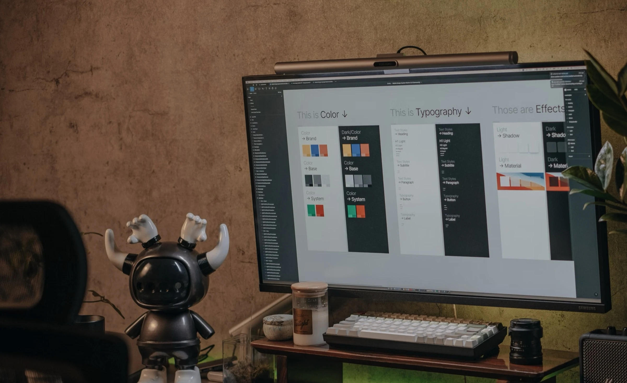
UX/UI design workspace

Design that is ready to ship

Many of the sites in our work were designed here — not only developed. UX/UI design at WALOO covers discovery, information architecture, and high-fidelity UI in Figma, with accessibility and performance treated as design constraints from the first frames.

We start from your brand and goals (or from a blank brief) and leave you with components, states, and responsive behavior a developer can implement without guessing. When we also ship Design to Code or WordPress Development, design and build stay one conversation.

Journeys that convert

Clear hierarchy and primary paths — landing, product, content, contact — stress-tested on real copy lengths so desktop and mobile do not diverge into one-offs.

We prototype what matters for enquiry and conversion, not theme-demo screenshots.

Discovery

Goals & audiences Align on who the product serves and which outcomes matter before pixels — so layout decisions serve conversion, not decoration.

Information architecture Sitemap and template map before high-fidelity work. We decide which pages earn custom layout versus reusable patterns.

Primary paths

Conversion journeys Landing, product, content, and contact flows designed as one system — hierarchy and CTAs tested on real copy lengths.

Prototypes that matter Interactive flows for enquiry and conversion paths, not theme-demo screenshots that ignore your content.

Responsive behavior

Desktop & mobile Breakpoints planned together so mobile is not a collapsed afterthought of the desktop composition.

Real content stress Long titles, short CTAs, and edge cases designed in — so production copy does not break the layout.

UI systems in Figma

Components, variants, and tokens your team can extend. Spacing, type, and states documented so brand stays intact when campaigns ship fast.

Handoff includes what is locked versus flexible — legal and brand guardrails without freezing marketing.

Components & tokens

Variants & states Buttons, forms, cards, and navigation with hover, focus, error, and empty states designed once — reused everywhere.

Spacing & type Token-level decisions so brand stays intact when campaigns ship fast and new pages reuse the system.

Brand guardrails

Locked vs flexible Legal and brand constraints called out explicitly — without freezing marketing where speed matters.

Campaign readiness Patterns that absorb new landing pages without inventing a one-off visual language each time.

Accessible UI

WCAG-minded design Contrast, focus, and keyboard paths considered in the file — targeting WCAG 2.2 AA on priority templates.

Semantic structure Heading order and landmark intent designed so accessibility is not a cleanup pass after build.

Built for production

Design decisions assume a real frontend: weight of imagery, interaction cost, and editor needs when the CMS is WordPress or a store admin.

We design for the stack you will ship — WordPress, commerce, or another frontend — not a deck that dies at handoff.

Production constraints

Imagery & weight Hero media and interaction cost scoped as design constraints so Core Web Vitals are not a surprise after launch.

Editor reality Fields, states, and flexible regions designed for how editors will actually publish — WordPress, commerce admin, or another CMS.

Handoff into build

Specs for builders Figma structure ready for Design to Code or your in-house team — same discipline either way.

Acceptance criteria What “done” means for responsive behavior, states, and accessibility — testable, not vibes.

Work with us

Send your URL. Get the plan.

We reply with a prioritized technical backlog — performance, stability, and conversion friction called out explicitly.